The Making of Coastline
The creation of a scenic wallpaper mural for Osborne & Little

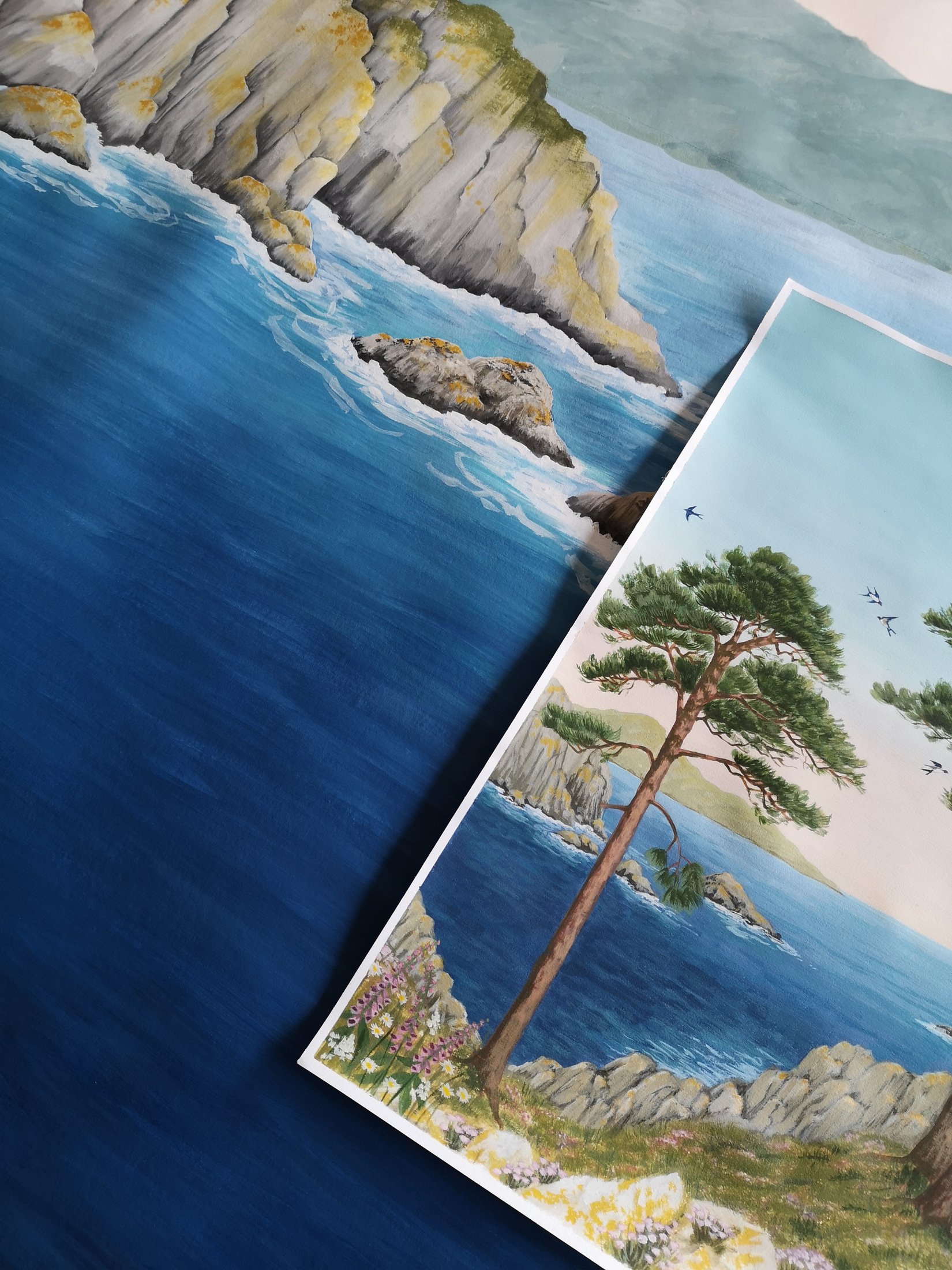
I am extremely happy to share my second collaboration with Osborne & Little as part of their Spring/Summer 2022 Lamorran Collection. It is a celebration of the British Coast. For this scenic mural wallpaper we focused on beautiful Cornwall for inspiration. A coastal scene of majestic cedar trees, on a headland dotted with foxgloves, overlooking a bay with rocky islands. After receiving the British coastal brief I started with a rough line drawing to check the repeat, then I did a colour rendering.


If you’ve visited Cornwall you’ll know there are some really turquoise waters like this but we decided that this version didn’t look British enough so it was back to the drawing board. We took out some of the land on the horizon, darkened the sea and took away the hydrangeas and agapanthus. This was the revised version:

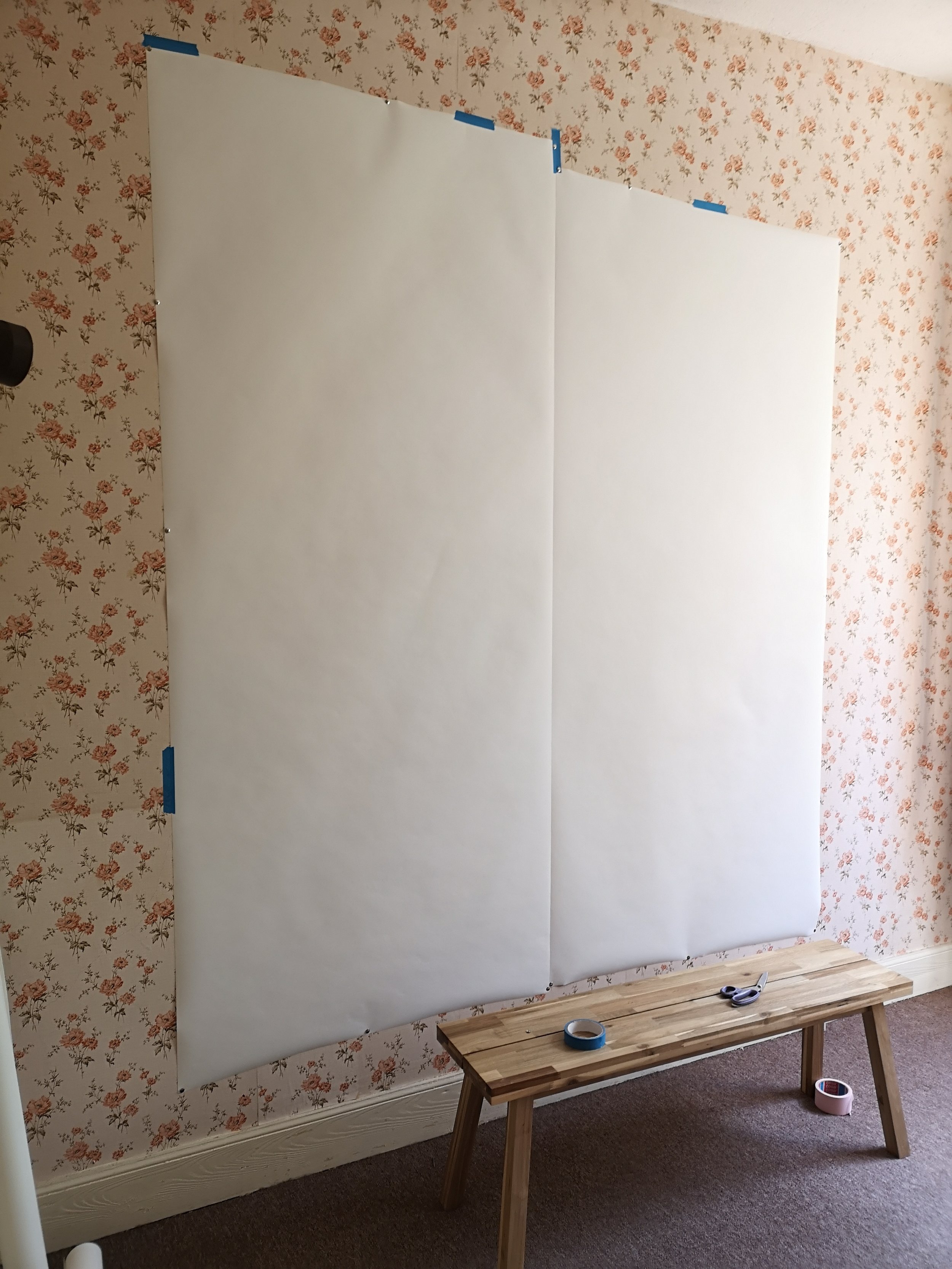
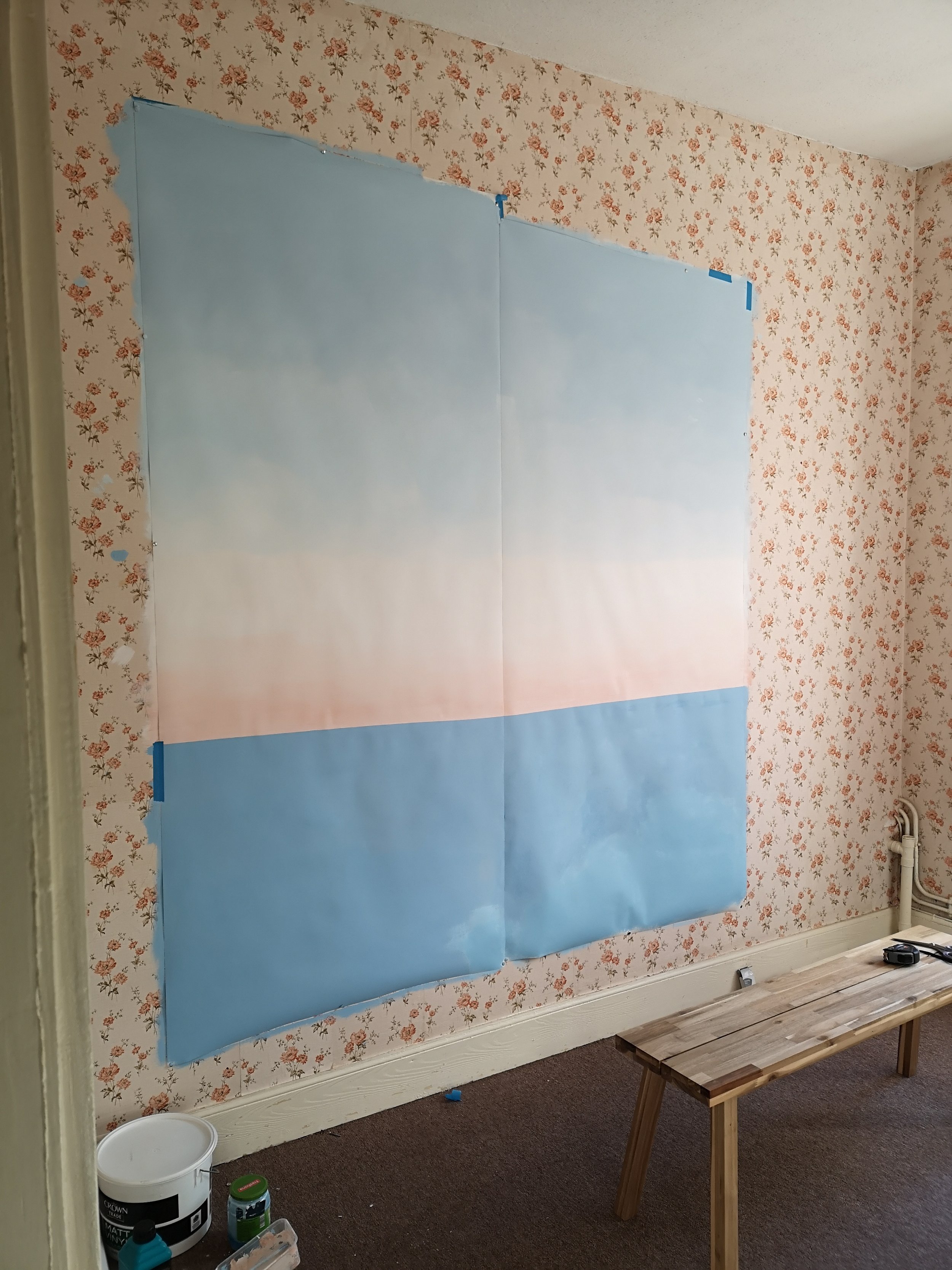
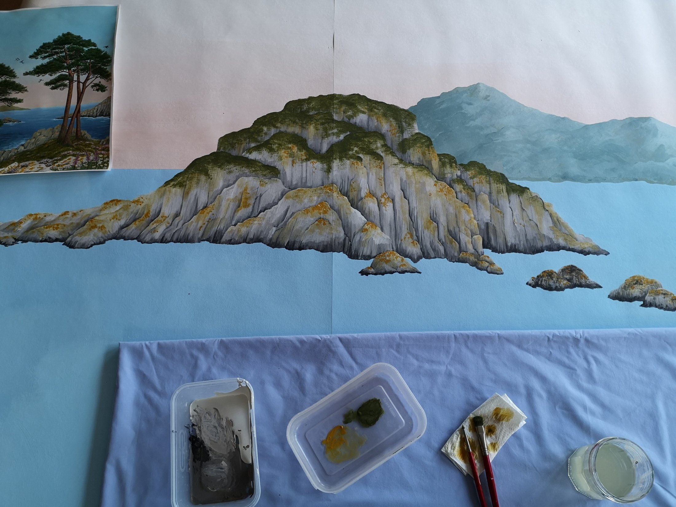
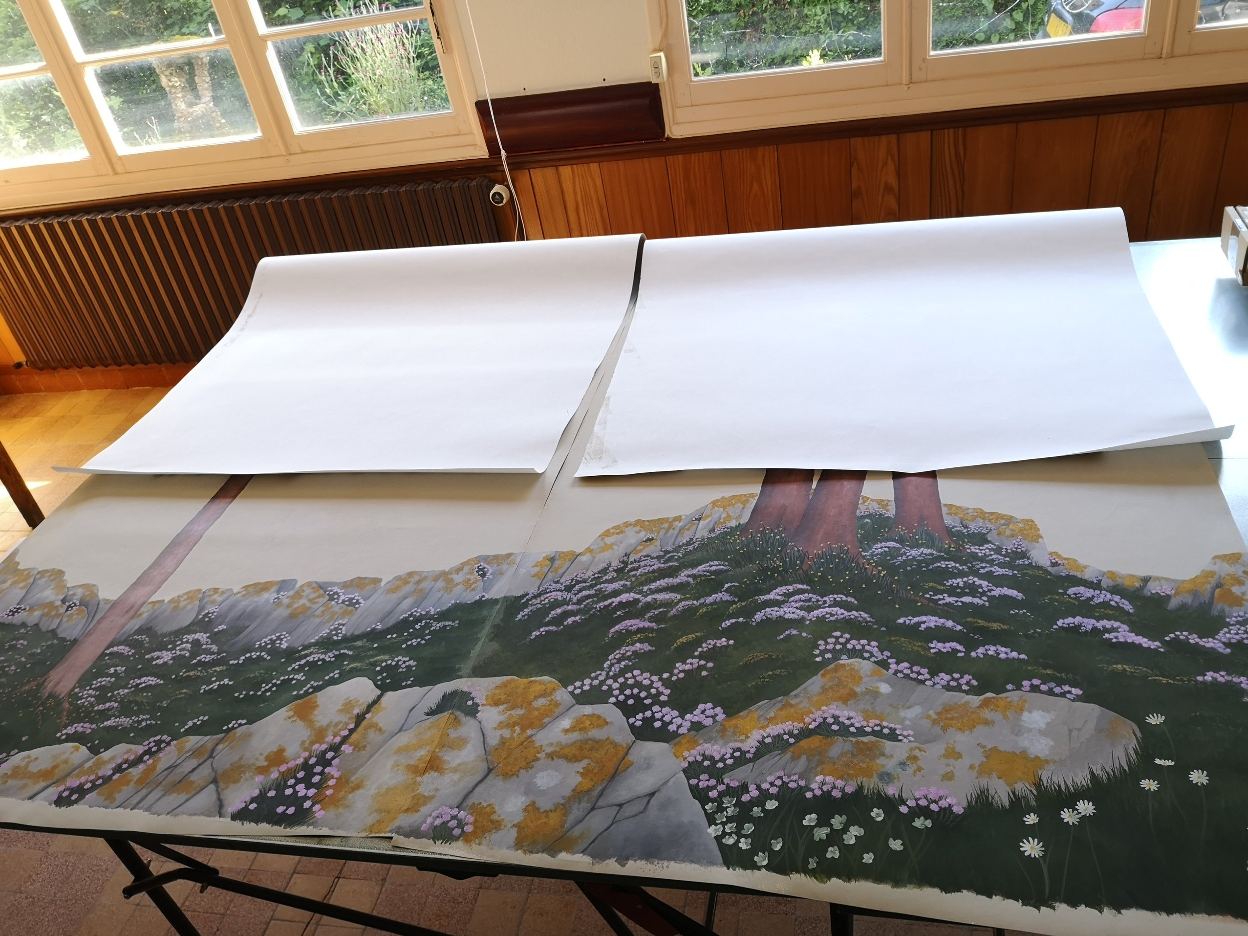
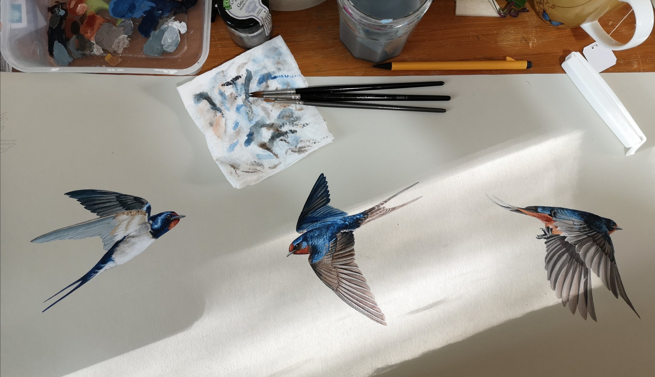
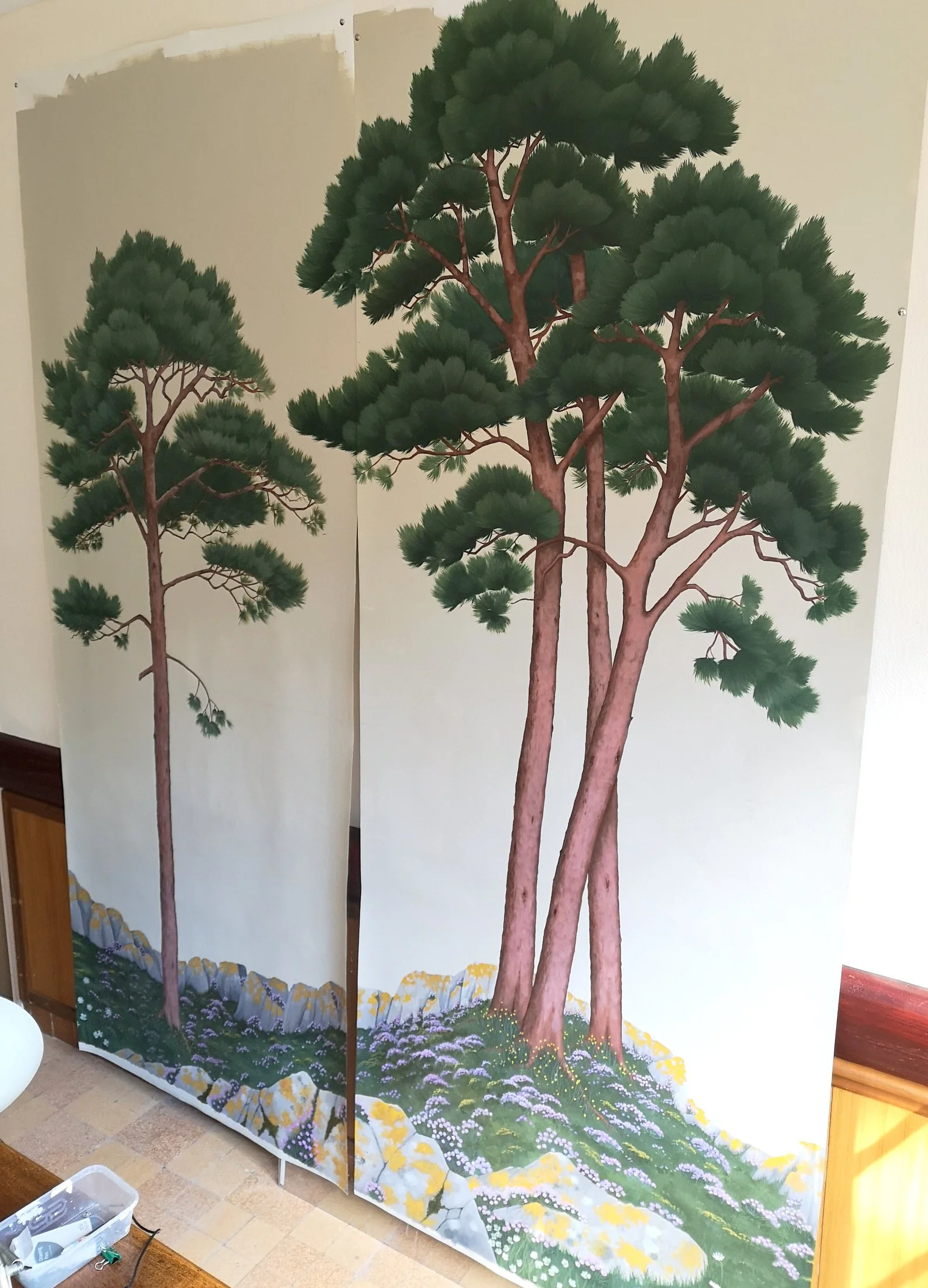
The only amendment we made to this one was to even out the top line of the foreground a bit. So now it was time to get painting. I was asked to paint the background layer, foreground, birds and flowers separately to aid with creating the separate colourways at the digital stage. It was all painted at life size which is a bit of a challenge at 3m tall! I used a mix of emulsions, acrylic and acrylic gouache paints starting on the background layer.
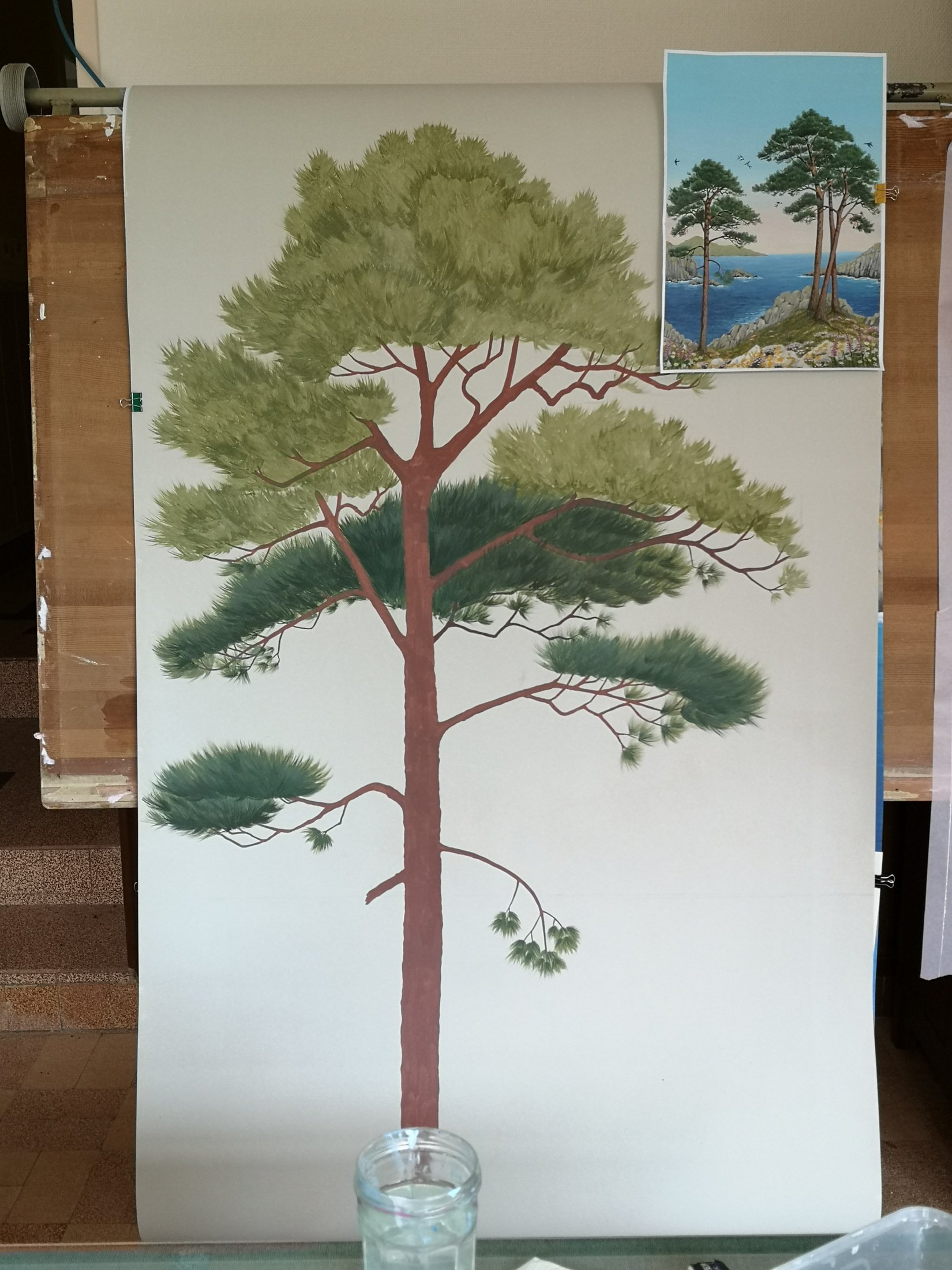
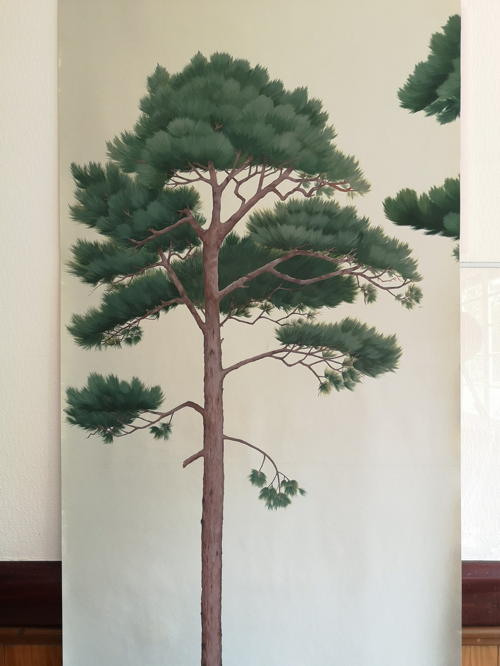
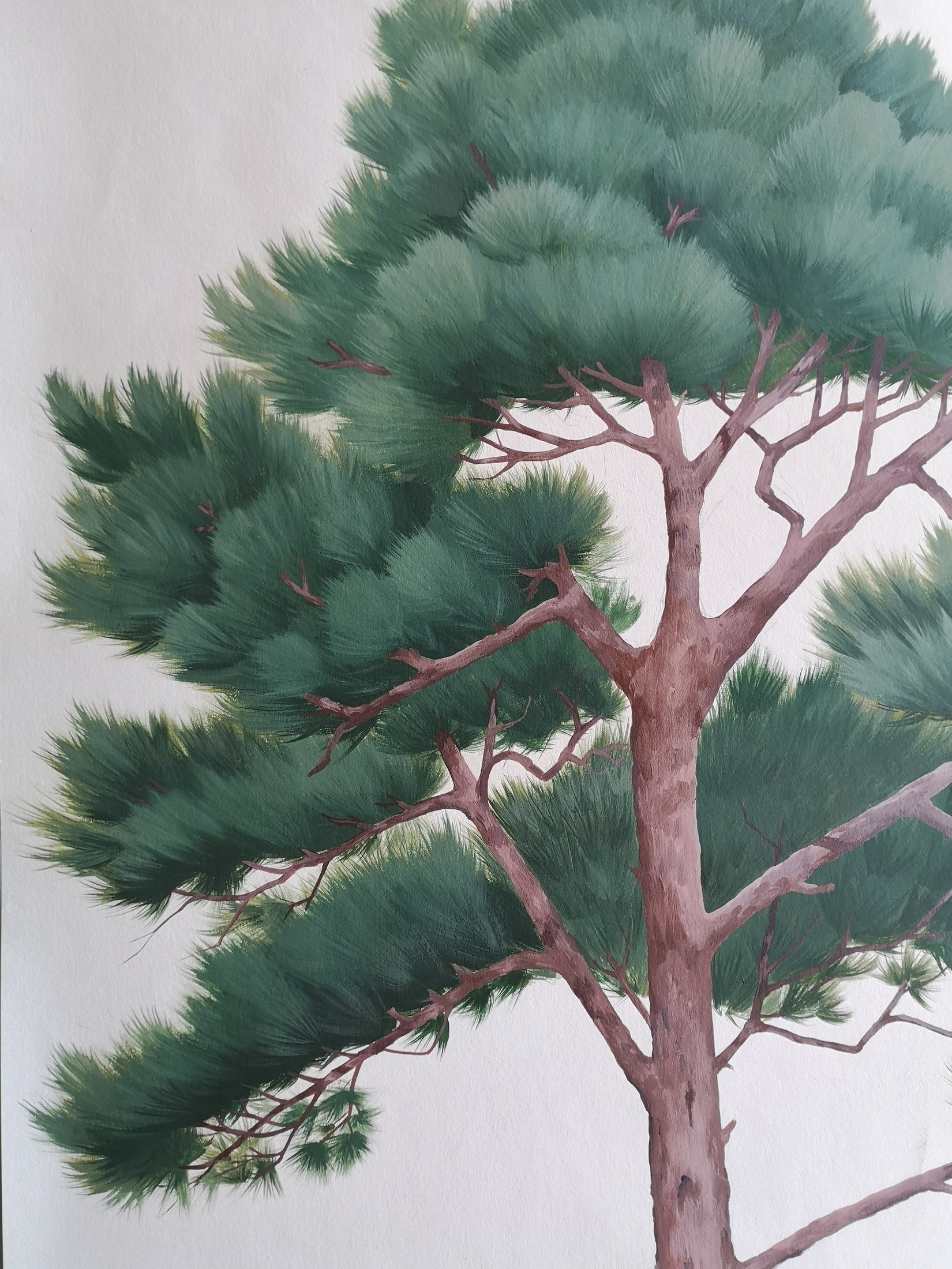
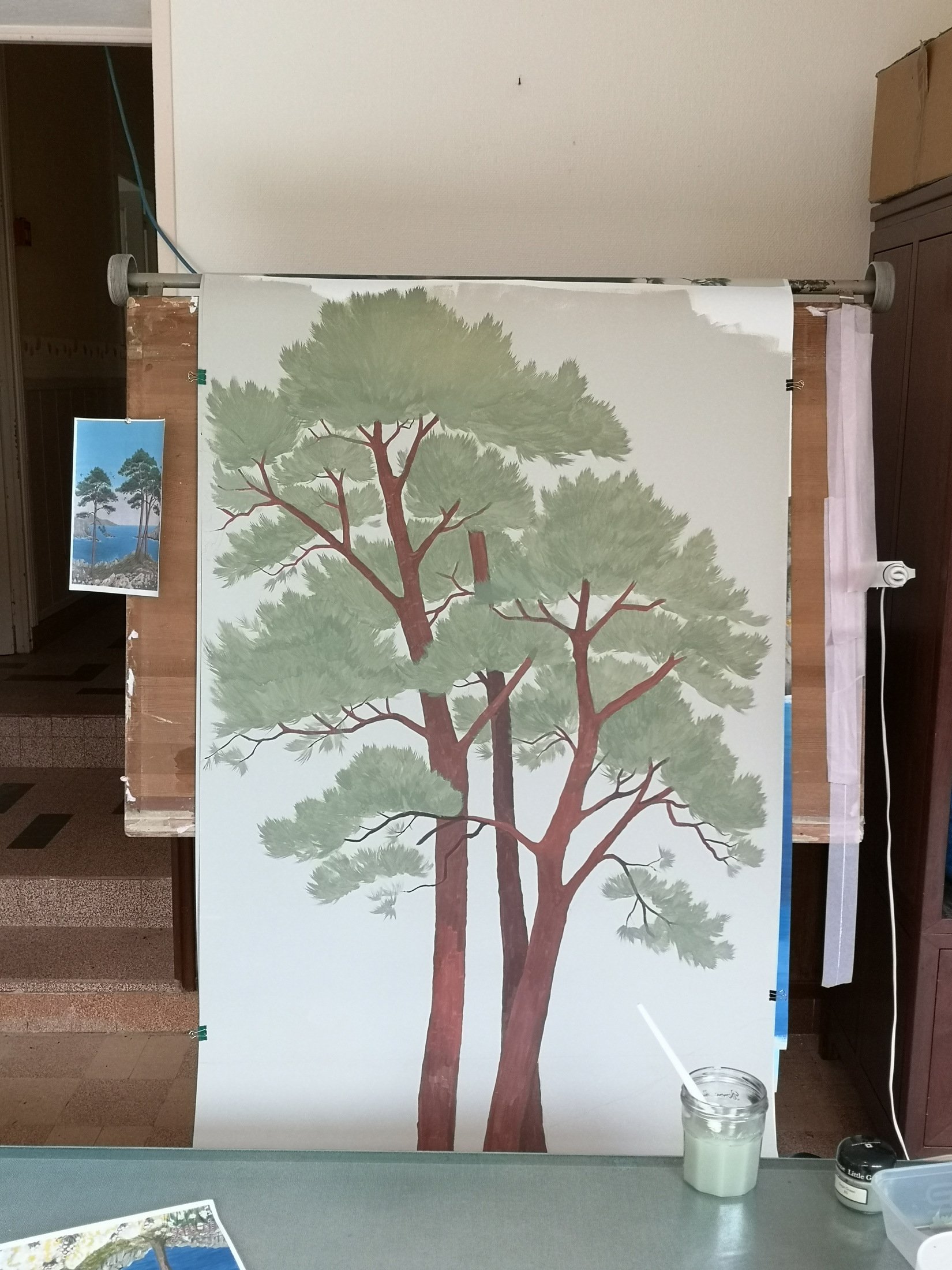
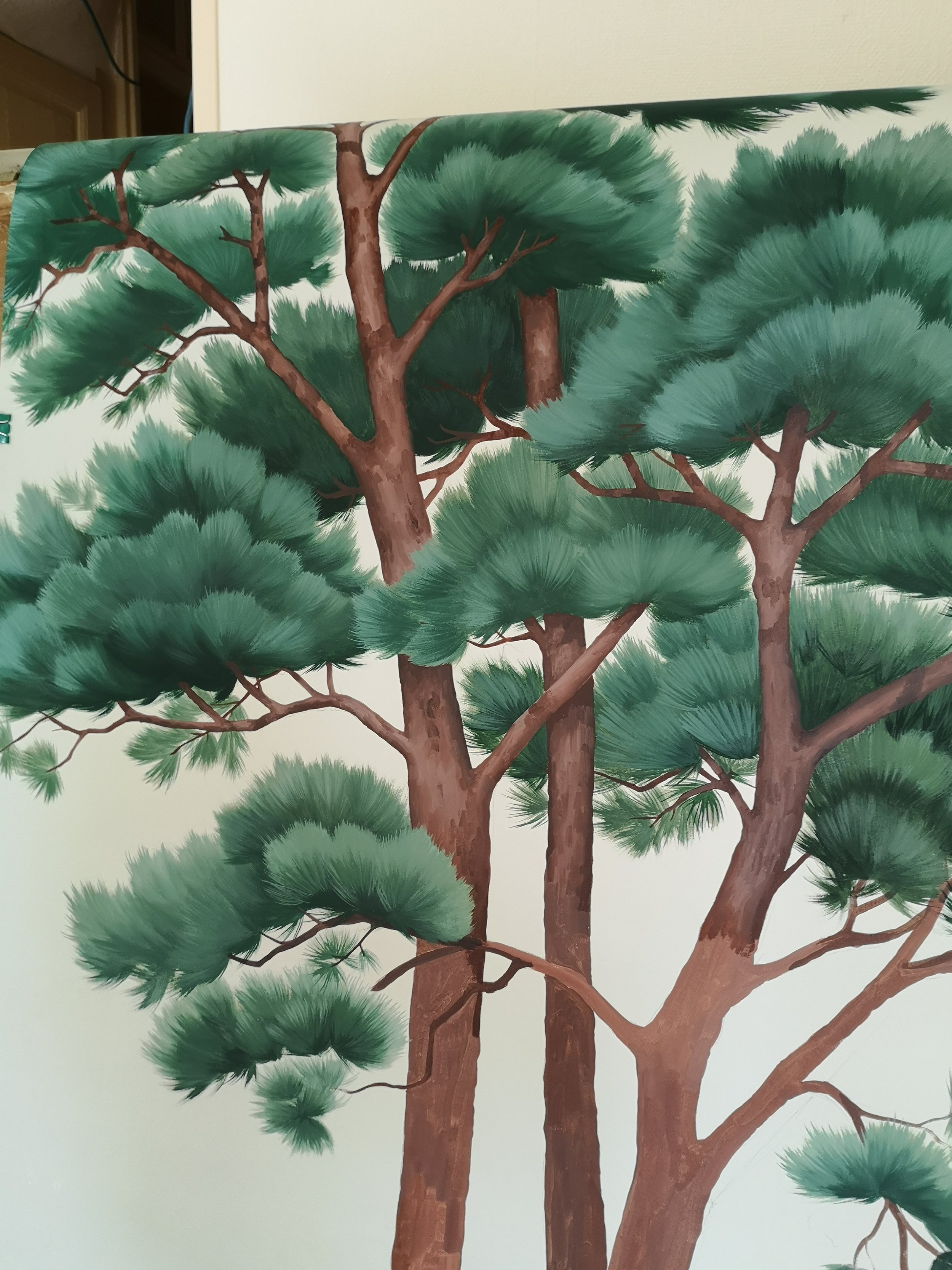
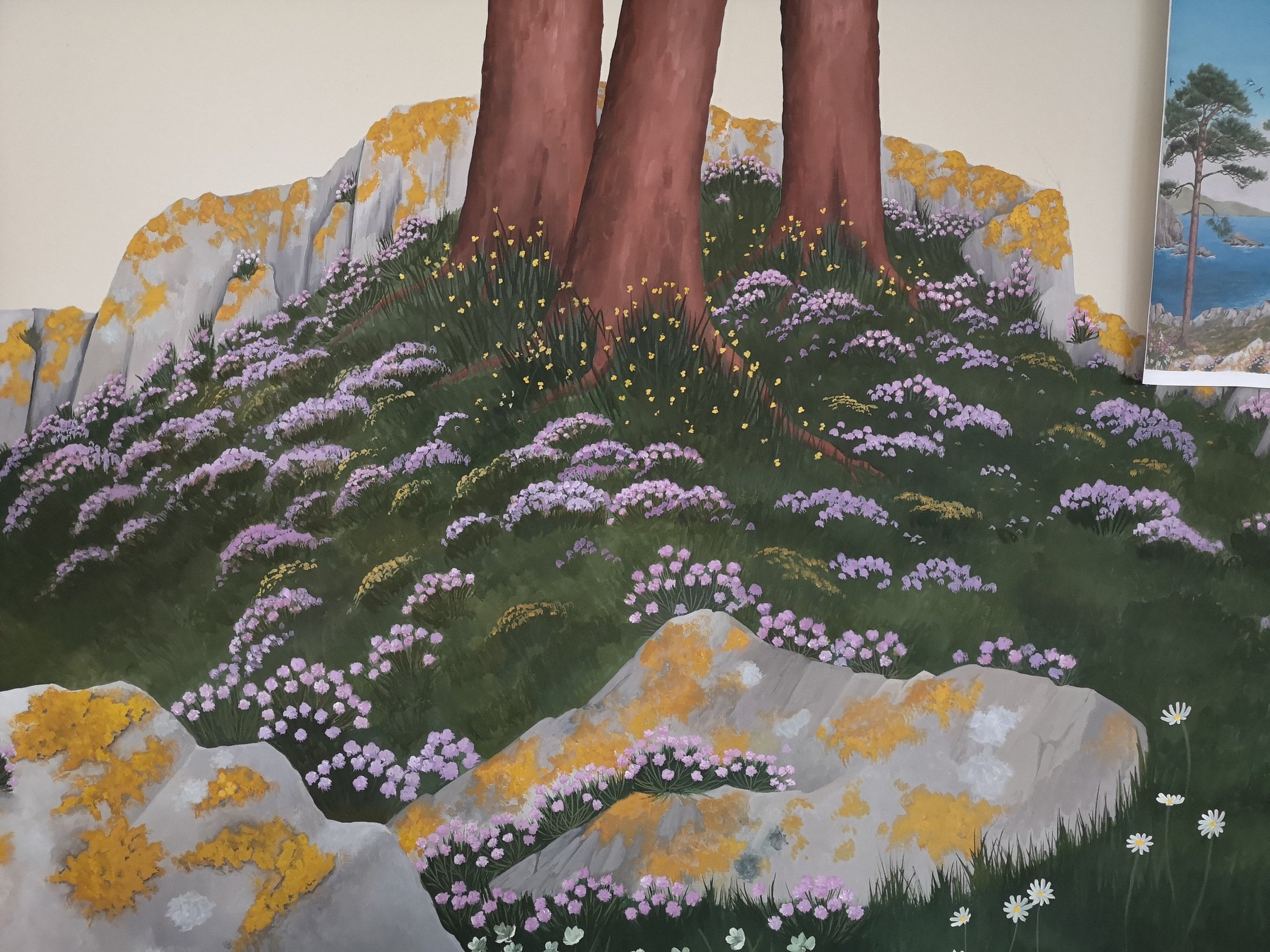
Next up, the trees, which were painted on a fresh layer of paper. It was my first time separating the design like this which was a little tricky, especially on such a large scale because you naturally balance the composition and colours when it is all on one plain. One advantage though is that you can see the silhouette of the trees more easily.
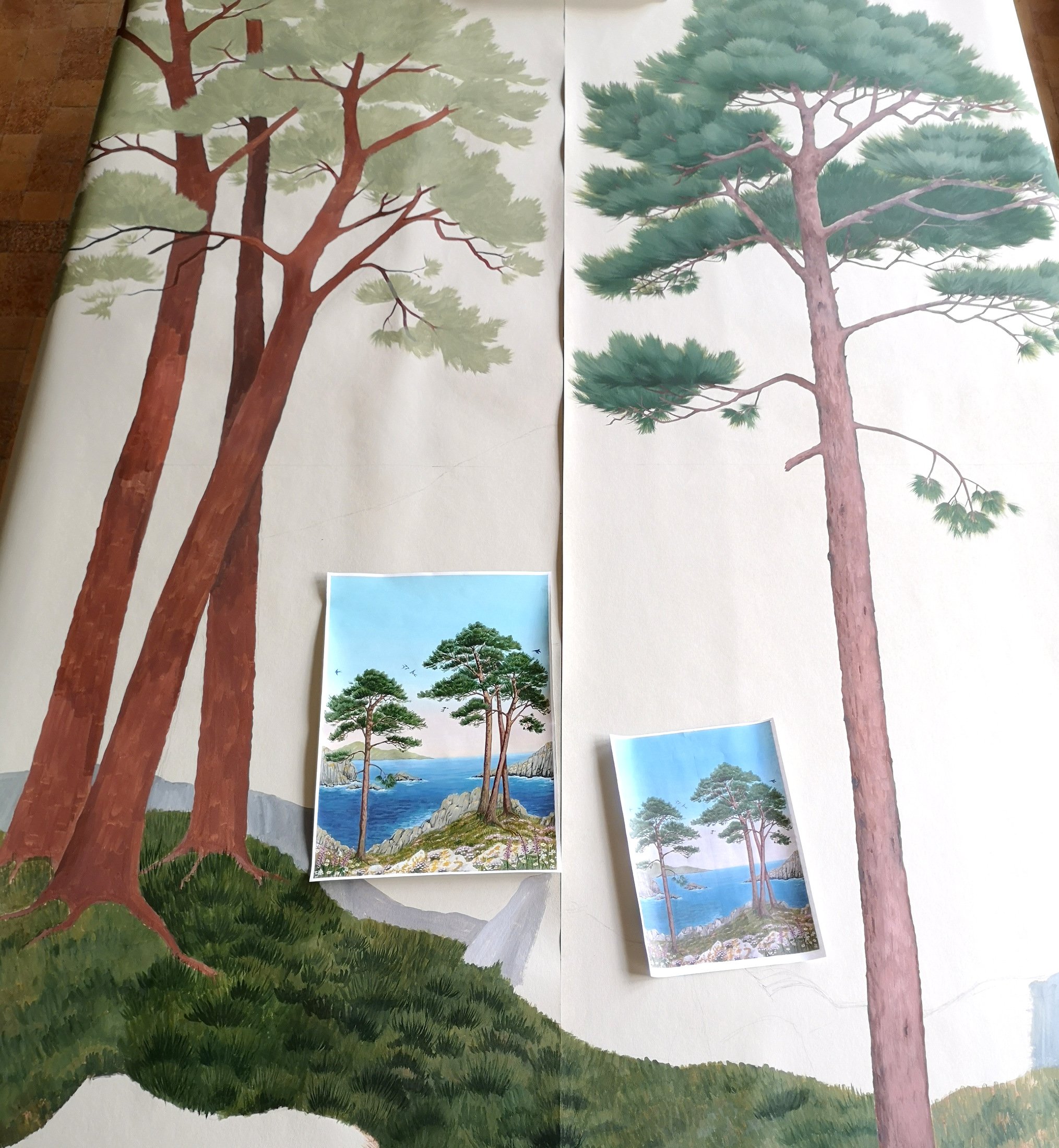
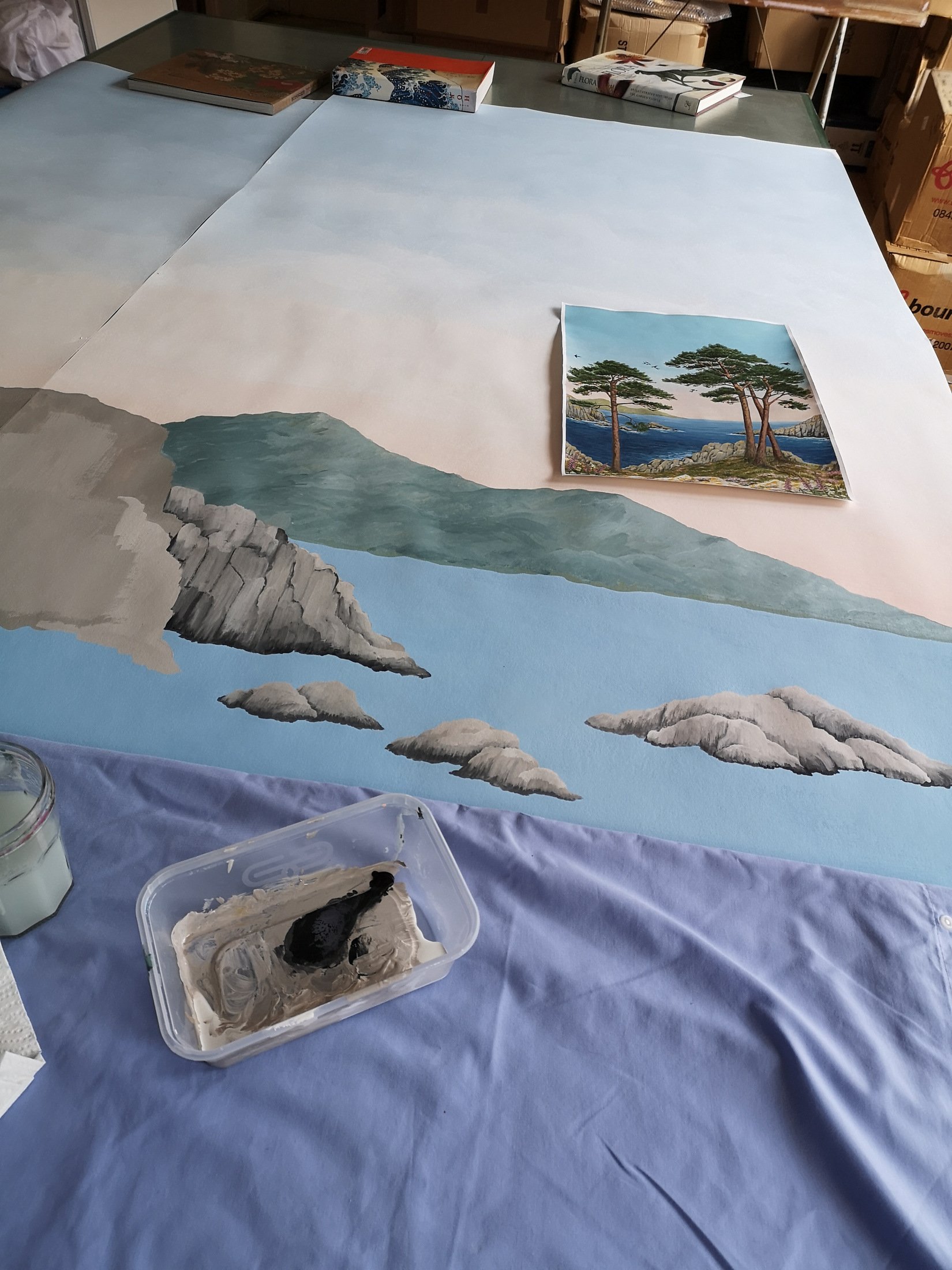
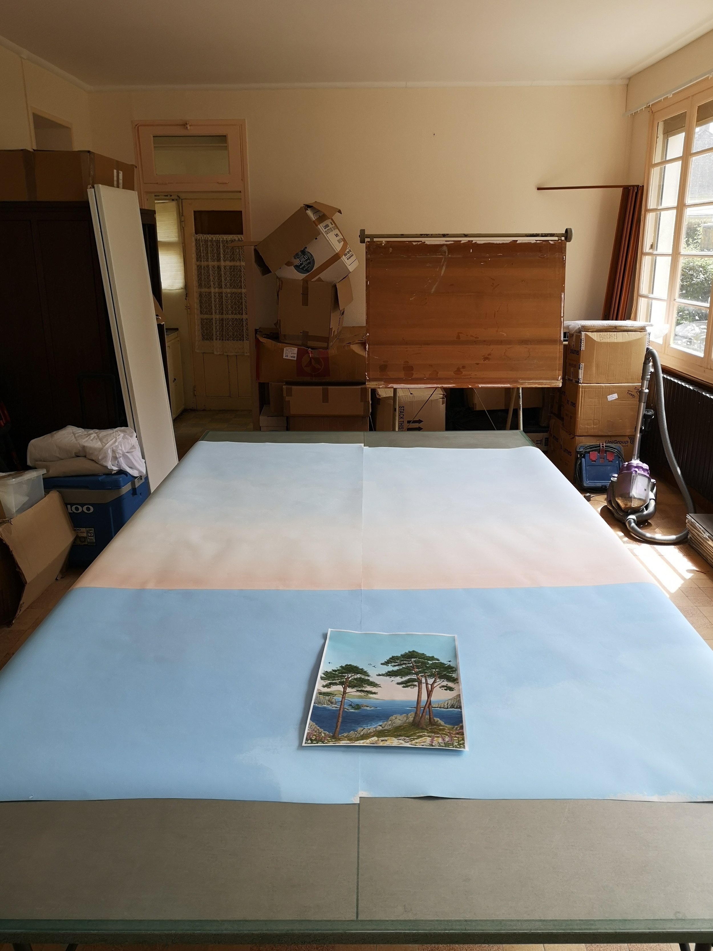
Next I moved on to the rocky, wild flower foreground. There was a lot of detail to add here so it took a while. My worktable for wallpapers of this size is actually a ping pong table! And yes, we do also use it for ping pong when I’m not working on a large scale project.
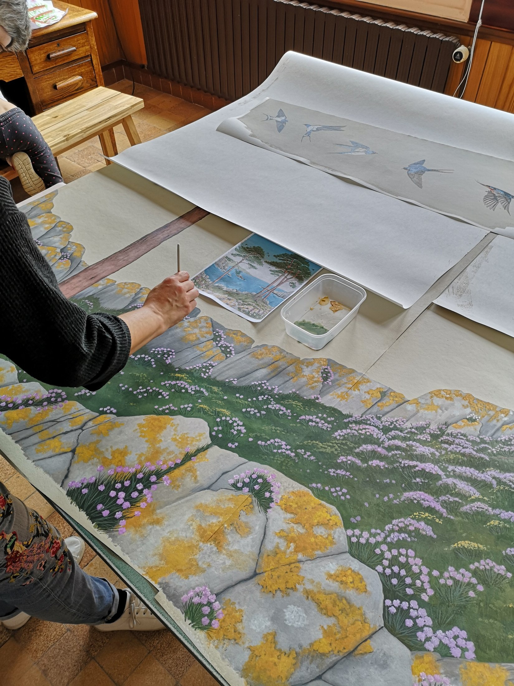
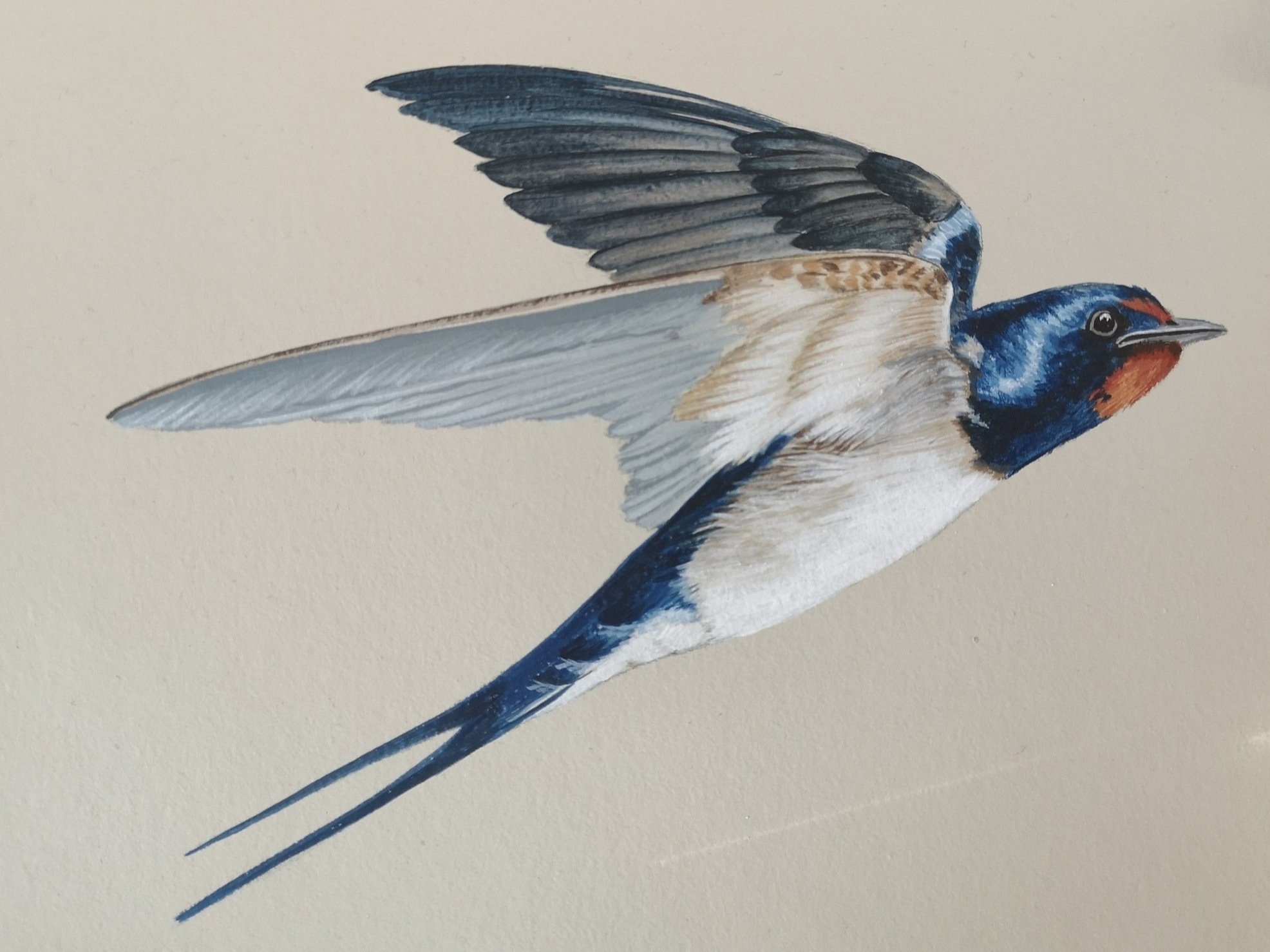
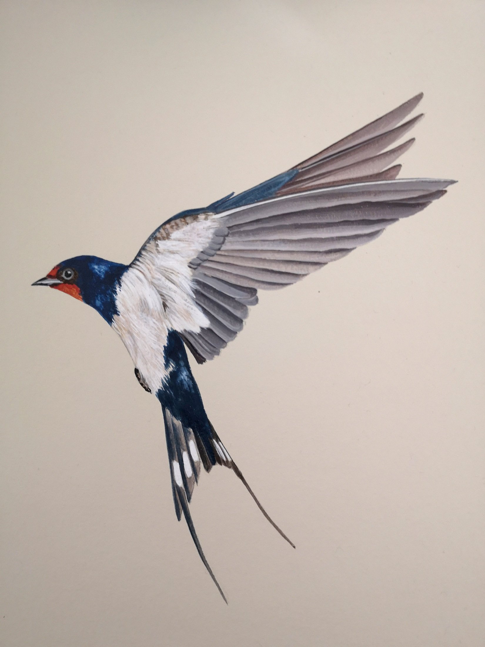
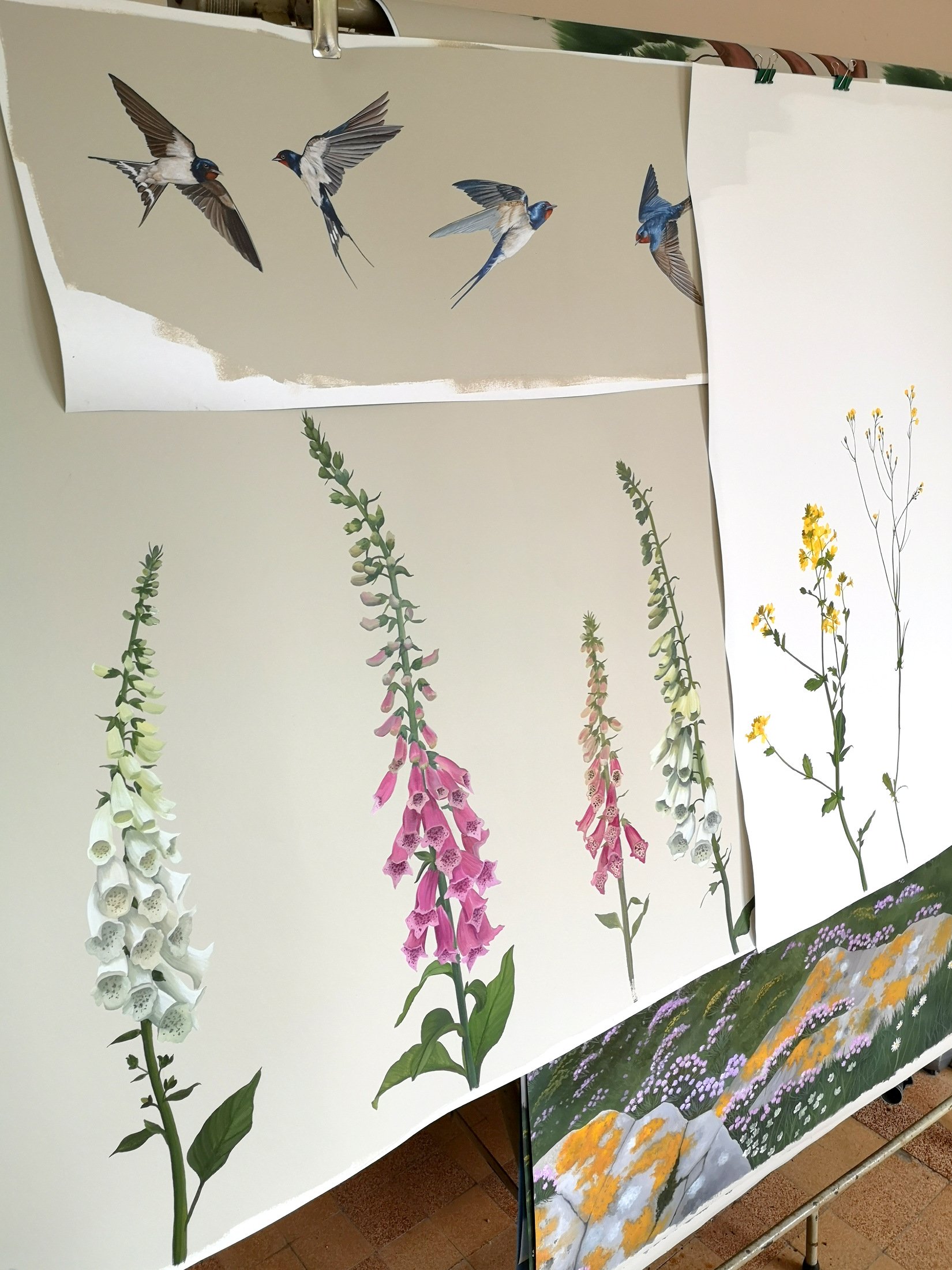
Next, the birds. I have painted many swallows over the years and I never get bored of them, they are just the prettiest little things so I was very happy they got to feature in this mural.
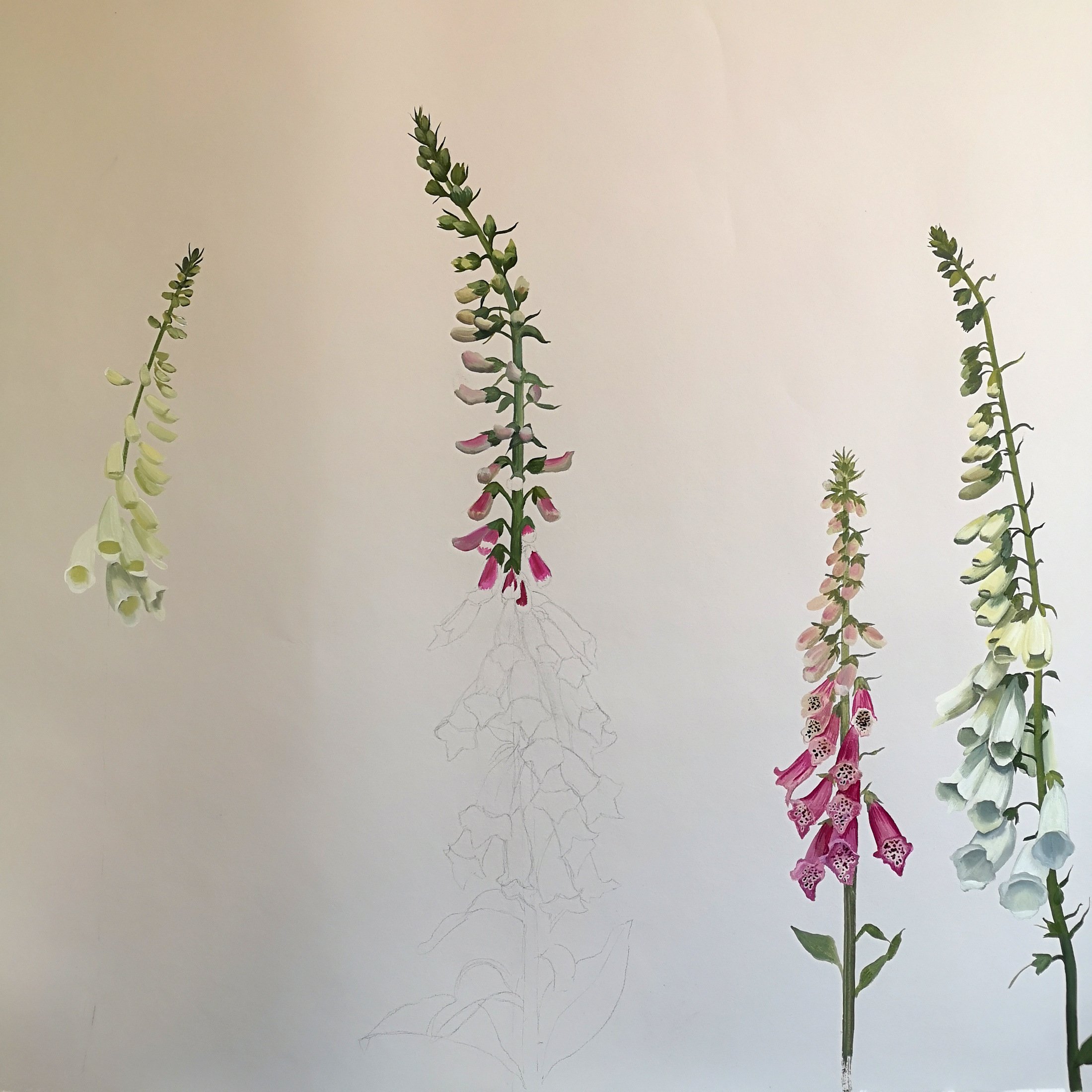
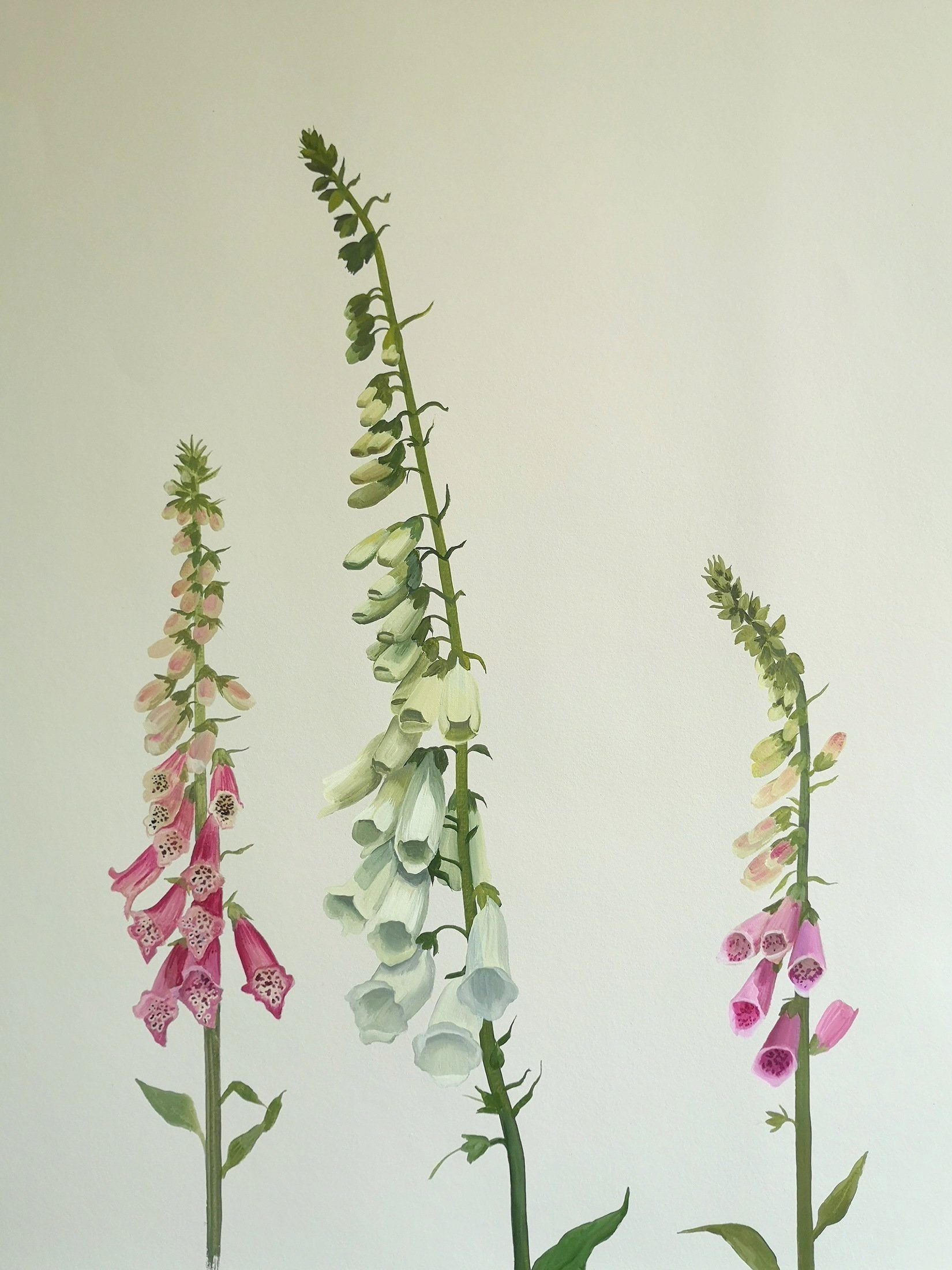
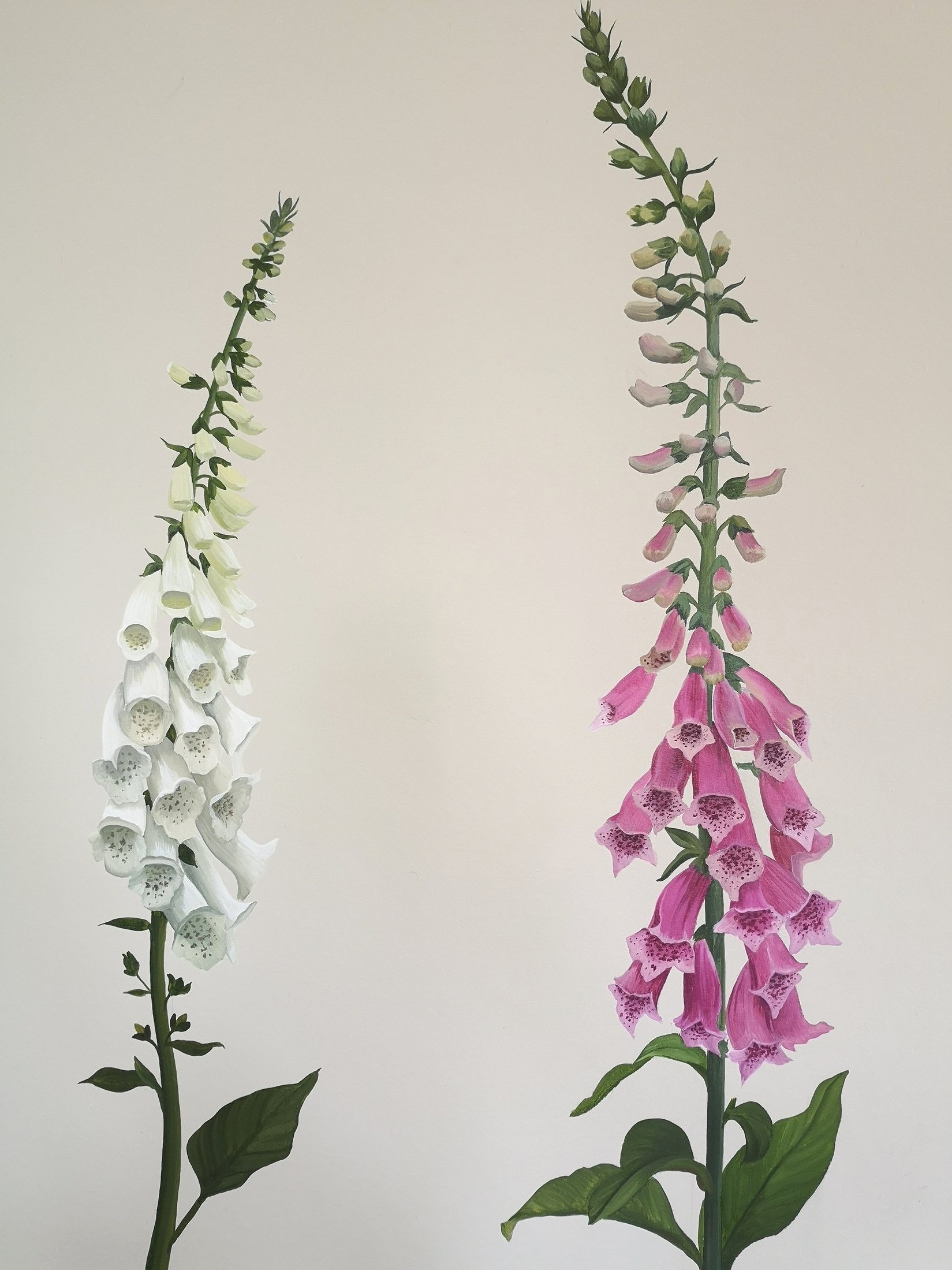
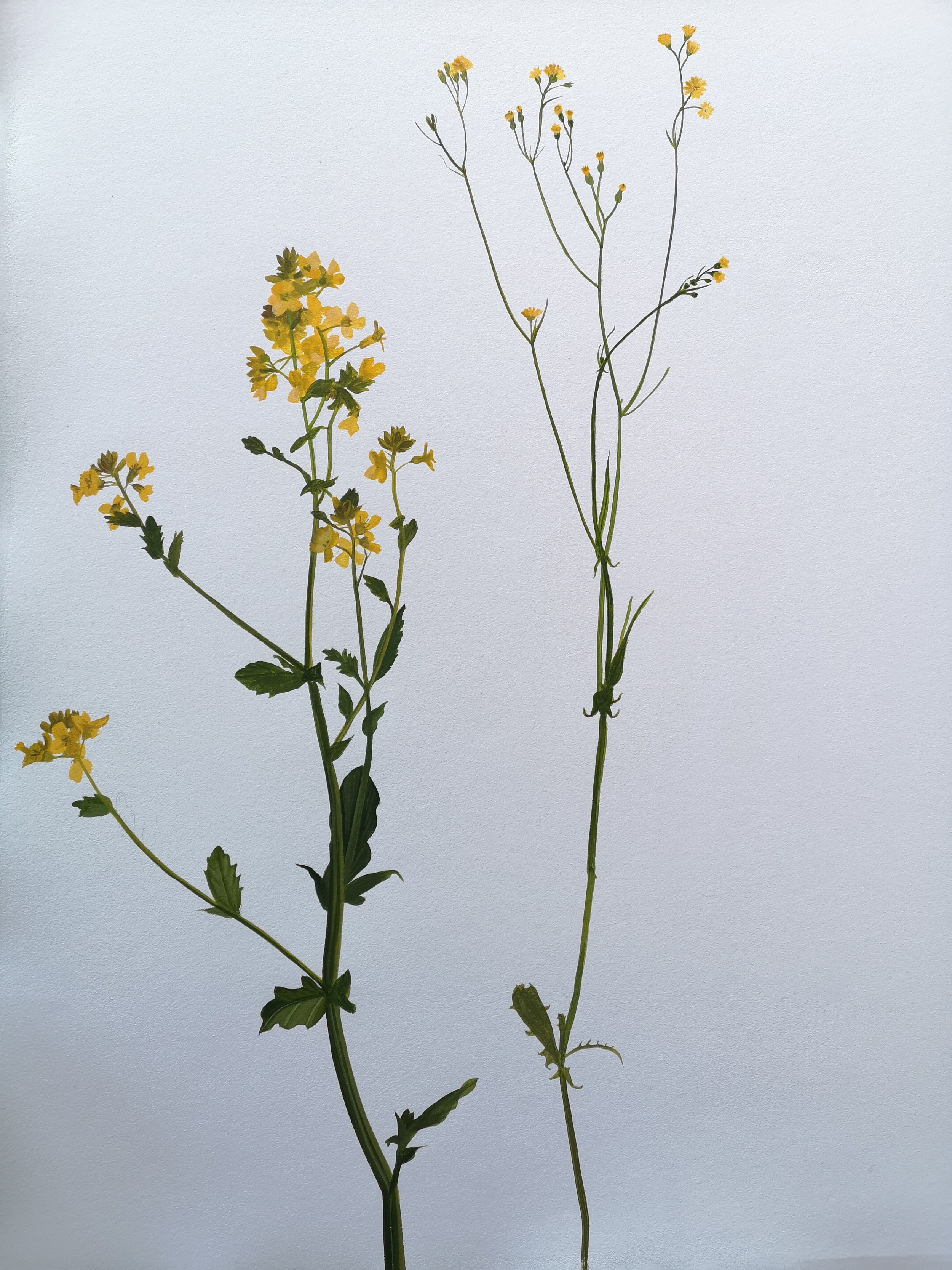
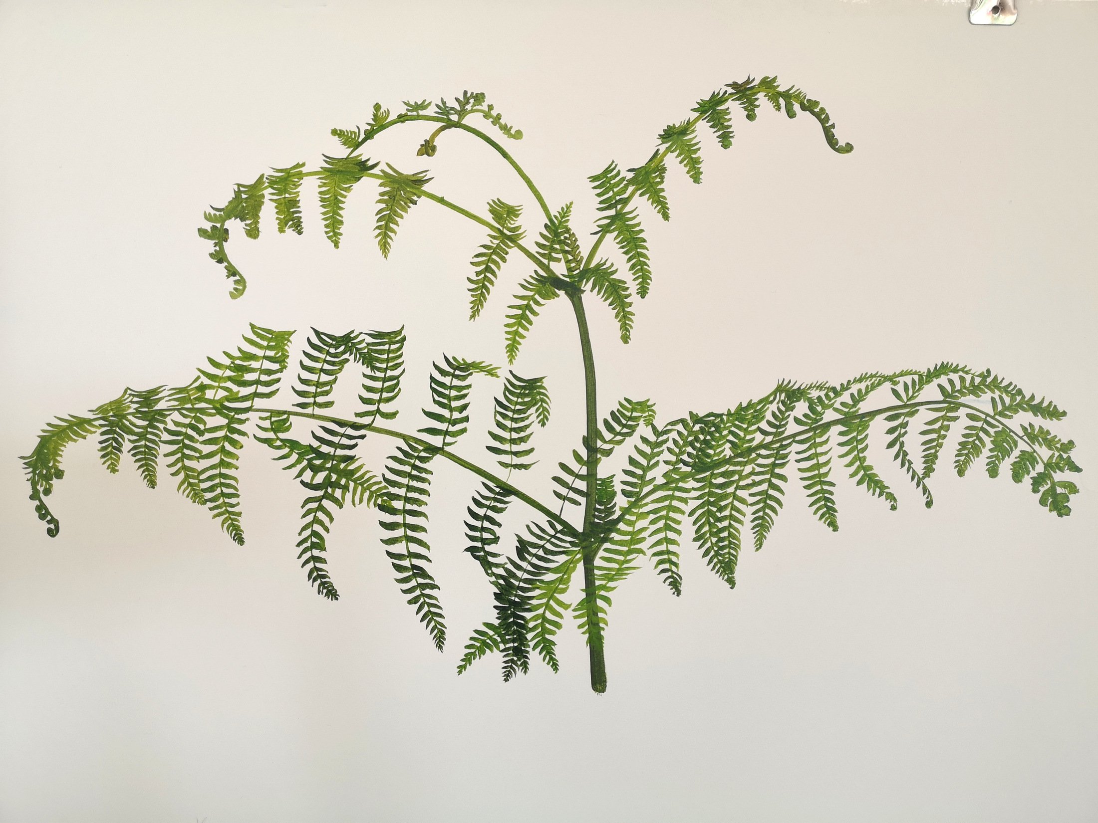
The final stage was to paint the foxgloves, wild flowers and fern. Foxgloves are one of my favourite flowers so this part was a real pleasure.
With all the components painted I checked over every part before rolling them up and sending them off to Osborne & Little HQ. It is always a nerve wracking experience entrusting months worth of work to a courier, especially when things can go missing!

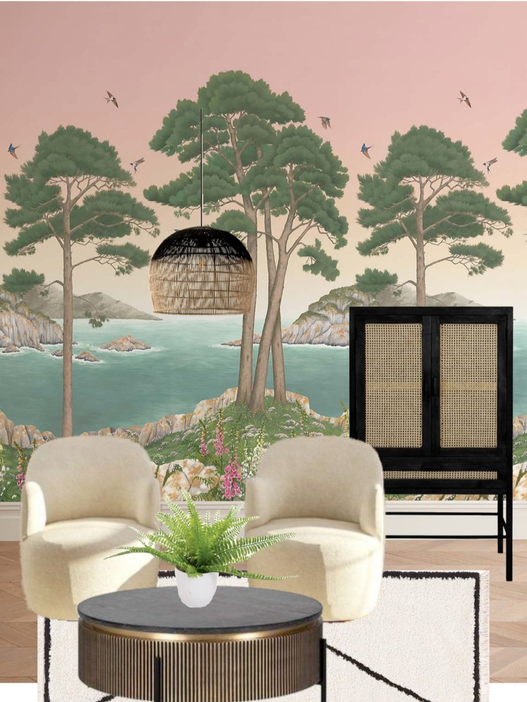
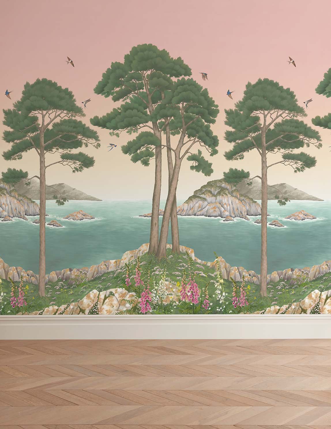
Thankfully it arrived safe and sound. The fabulous design team at Osborne & Little had all the component parts cut out and they then pieced the design together making the different colourways. I was a bit nervous about the pink one but when my samples arrived, both my husband and I fell in love with it, the tone of pink and the way it subtly fades down into the lightest creamy peach radiates such a warmth that it draws you into the scene in the most nurturing way. I’m never usually emotional about my artwork but I confess to welling up when I pinned up the pink one and stood back. I wasn’t planning on putting a mural up in what will eventually be our lounge (it is currently my makeshift studio) but it just looks at home in this spot so we are going to change our design plans for the room to accommodate it. This was the moment when we first pinned up the sample:

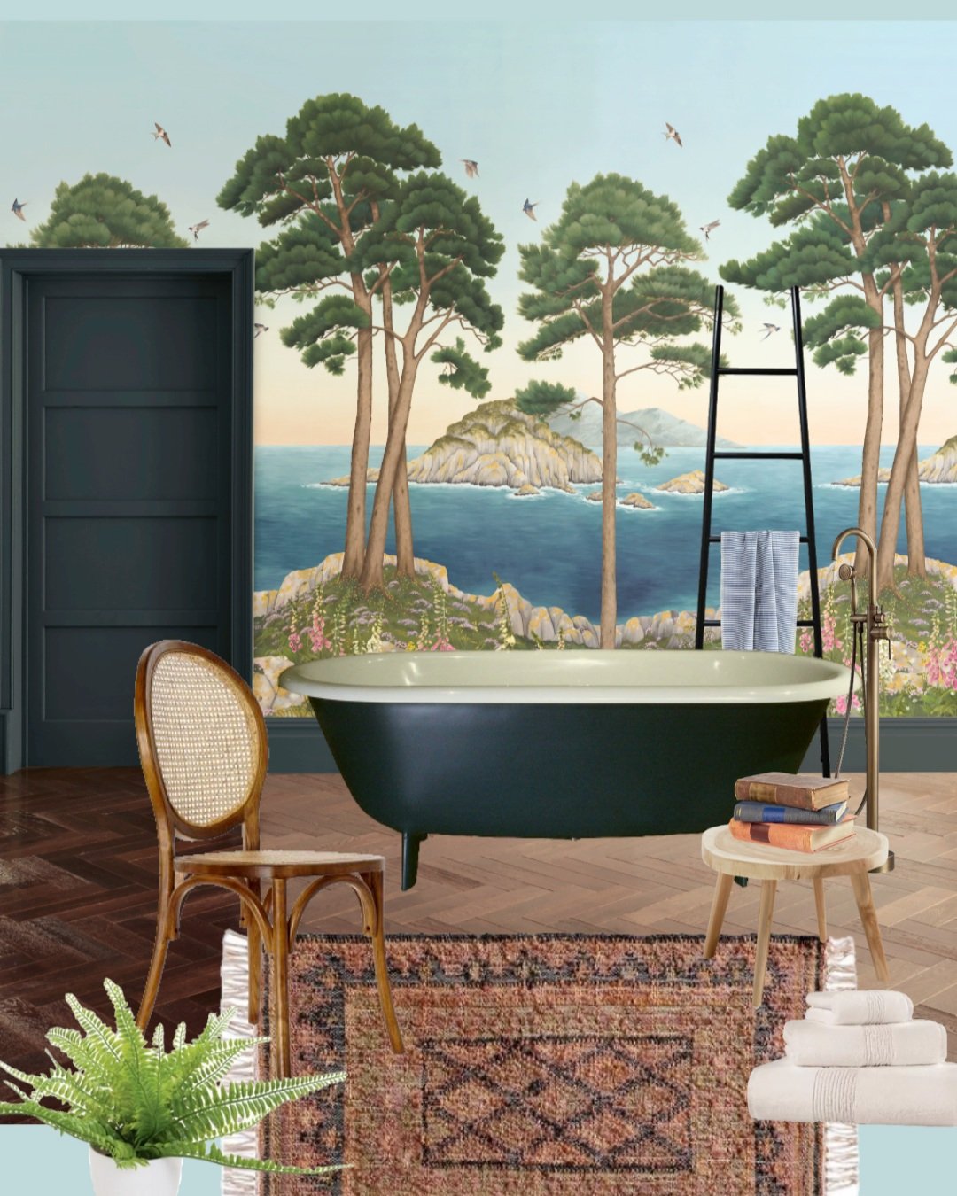
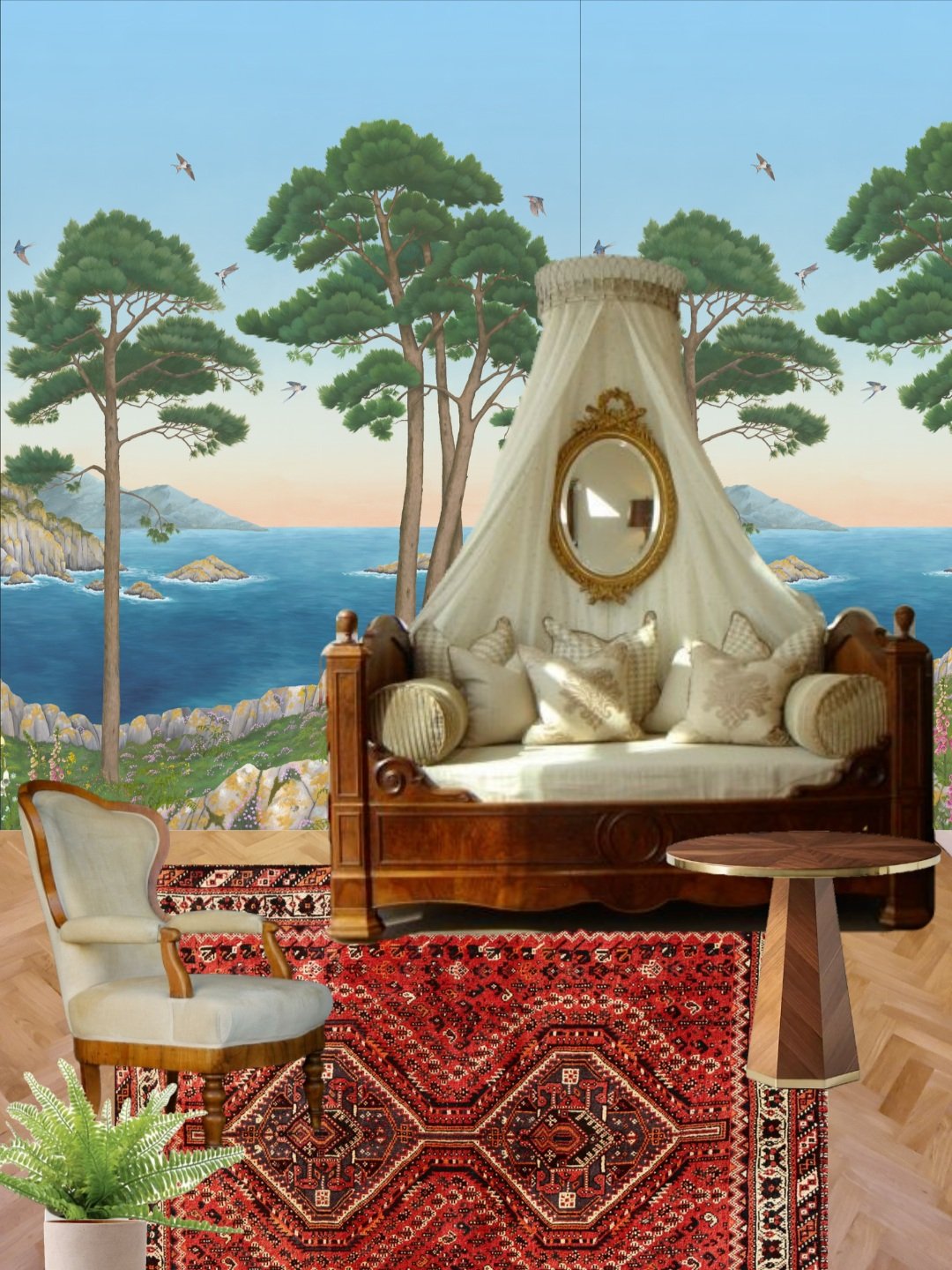
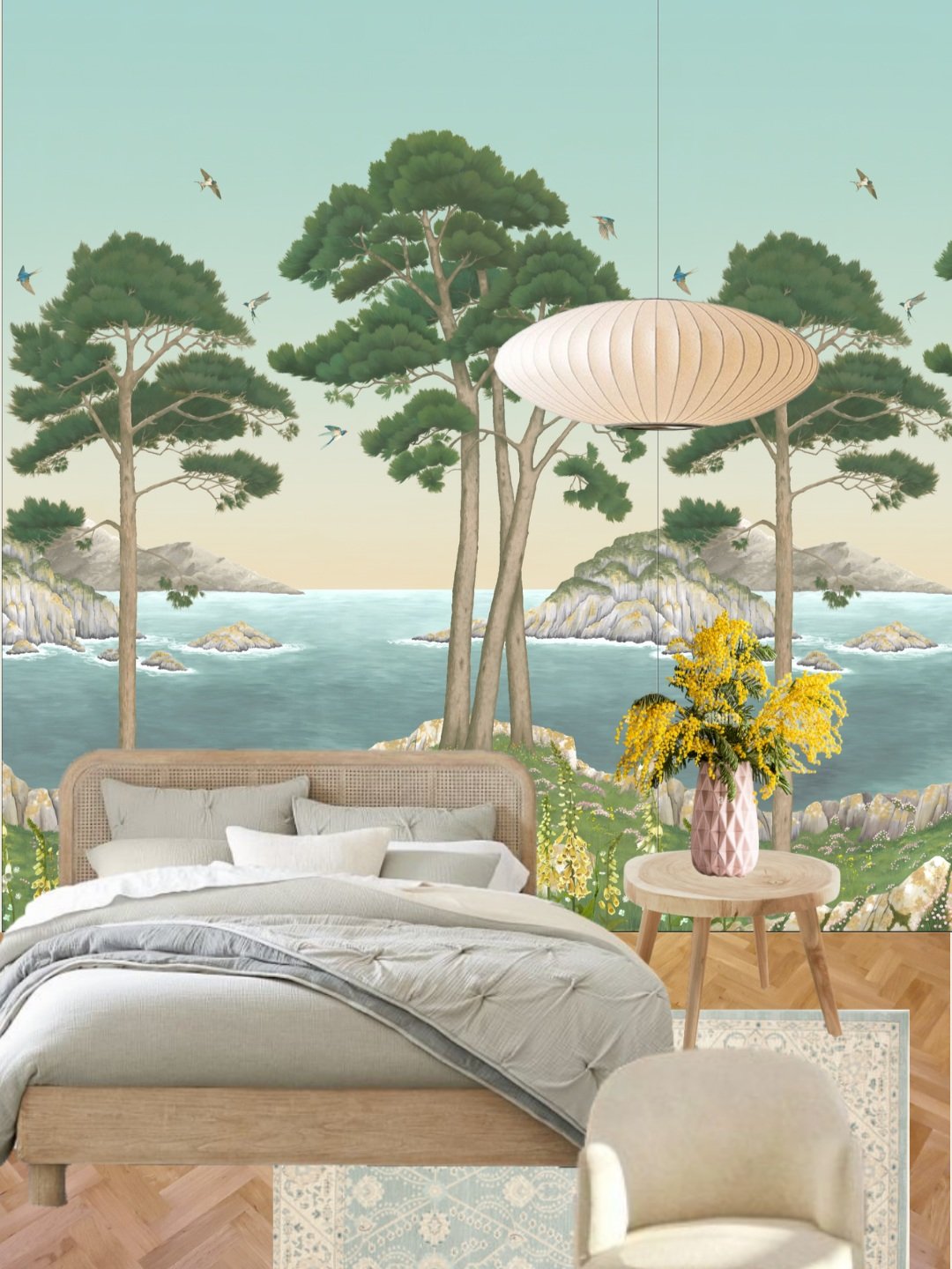
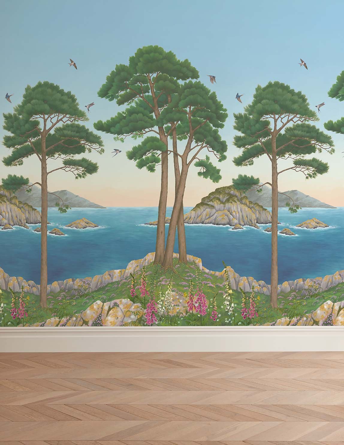
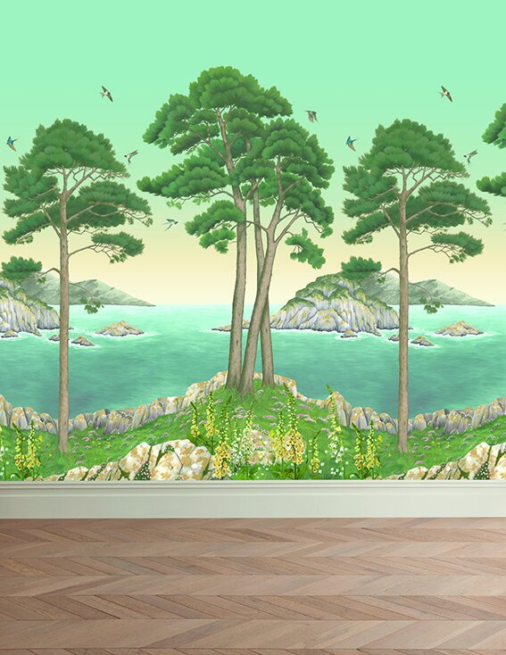
Each of the colourways has quite a different feel. As I said above the pink one has an enveloping warmth to it, the blue one is punchy and energising, and the aqua is fresh and tranquil, like a summer dawn.
And just for fun I put together some mood boards to show how versatile the mural is, blending well with both classic and modern schemes.